
Accessibility Is a Feature, Not a Checkbox: Five Fixes From Auditing 1,000 Pages
We audited our own 1,000-page tools platform against WCAG. Five fixes delivered most of the value: skip links, live regions, contrast, keyboard paths and honest error states.
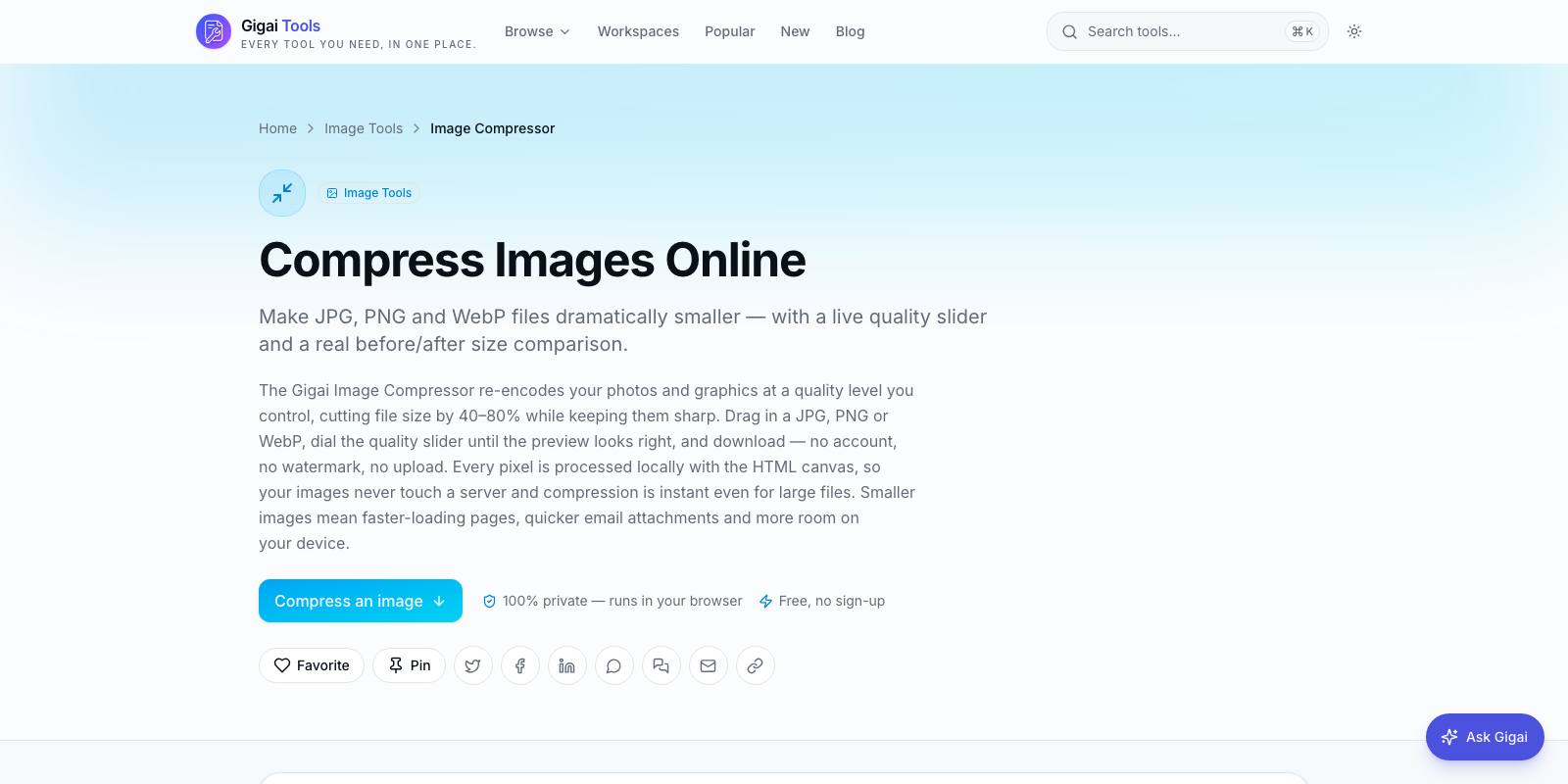
When we crossed 248 tools on our Gigai Tools platform, we did what most teams do: we ran Lighthouse, saw scores in the nineties, and quietly congratulated ourselves. Then we spent a week actually using the platform the way a screen reader user or a keyboard-only user would. The scores had told us almost nothing. Pages that audited "clean" were, in practice, unusable: results appeared silently, focus vanished into the void after a modal closed, and a drag-and-drop zone was the only way to load a file.
That gap — between passing an automated check and being genuinely usable — is why we say accessibility is a feature, not a checkbox. A checkbox is something you satisfy once. A feature is something you design, test, and maintain, because real people depend on it.
This is what we learned auditing roughly 1,000 pages of our own product, distilled to the five fixes that carried the most impact, plus how we test without a dedicated budget and why we think this work pays for itself commercially.
Why automated scores lied to us
Automated tools like Lighthouse and axe catch maybe a third of real accessibility problems — the mechanical ones: missing alt text, missing labels, invalid ARIA. They cannot tell you that your "conversion complete" message never reached the screen reader, or that tabbing through your page takes 47 keystrokes before hitting the actual content. Those are behavioural failures, and behaviour only shows up when you drive the interface the way an affected user does.
Our platform is entirely client-side — files are processed in the browser and never uploaded — which means almost everything interesting happens asynchronously after page load. That architecture is great for privacy and terrible for accessibility by default, because dynamic updates are invisible to assistive technology unless you explicitly announce them. Most modern SPAs have exactly this problem and exactly these blind spots.
Fix one: skip links, the cheapest win we found
Every one of our tool pages shares a header: logo, category navigation, search. For a keyboard user, that meant tabbing through the same 20-plus links on every single page before reaching the tool itself. Multiply that across a session of five or six tools and you have made your product hostile.
The fix is a single anchor as the first focusable element — "Skip to main content" — visually hidden until it receives focus, jumping to the main landmark. It took us under an hour to implement across the whole platform because the header is one shared component. If your header is copy-pasted per page, that is a code-structure problem wearing an accessibility costume; fix the duplication and the skip link comes almost free.
One detail that trips teams up: the target needs tabindex="-1" or focus will not actually move in all browsers. Test it by pressing Tab once on page load and hitting Enter. If focus does not land inside your content, the skip link is decorative.
Fix two: live regions for anything that happens without a page load
This was our biggest failure and the fix with the highest impact. When a user converts a file, compresses an image, or generates a QR code on our platform, the result appears in the DOM without navigation. A sighted user sees it instantly. A screen reader user hears nothing — the tool appears to have simply stopped working.
The answer is ARIA live regions. We added a single polite live region to our shared tool harness — the wrapper component every tool renders inside — and routed all status messages through it: "Processing", "Done — 3 files ready to download", "Failed — file appears to be corrupted". Because the harness is shared, one change fixed the announcement behaviour of every tool at once.
Rules we settled on after trial and error:
- Use aria-live="polite" for results and progress; reserve assertive for genuine emergencies, because assertive interrupts whatever the user is doing
- The live region must exist in the DOM before the update happens; injecting a live region and its message together is often not announced at all
- Announce counts and outcomes, not vague states — "5 pages extracted" beats "Success"
- Debounce progress announcements; announcing every percent turns a screen reader into a metronome
Fix three: contrast, where design taste quietly fails people
Our muted captions and placeholder text were a common grey — the one many Tailwind projects reach for by default — which measures roughly 2.5:1 against white. WCAG requires 4.5:1 for normal text and 3:1 for large text. That grey fails both, and it fails hardest for the low-vision users, older users, and anyone on a budget phone screen in sunlight — which describes a very large share of real-world traffic.
We darkened two grey tokens in our design system and the entire platform passed, again because the values lived in one place. The lesson is less about colour and more about architecture: if fixing contrast requires touching hundreds of files, your styling is the real problem. We keep a colour contrast checker among the free tools on Gigai Tools, and we now run every new palette token through it before it ships — thirty seconds of checking against hours of retrofitting.
Fix four: keyboard paths through every core flow
Drag-and-drop was the poster child here. Several of our tools originally presented a drop zone as the primary file input. Beautiful with a mouse; a dead end with a keyboard. Every drop zone now wraps a real file input reachable and operable by keyboard, and the drop behaviour is a progressive enhancement on top.
Beyond that, we walked each tool's core flow — load file, configure, run, download — using only Tab, Shift+Tab, Enter, Escape and arrow keys, and fixed whatever broke. The recurring offenders were predictable: clickable divs instead of buttons, modals that did not trap focus and did not return it on close, custom dropdowns without arrow-key support, and focus outlines removed for aesthetics with nothing put back. Restoring a visible focus indicator is one CSS rule; removing it saved nobody anything.
Fix five: honest error states
An error message is an accessibility feature. "Something went wrong" is not honest and not actionable for anyone, but it is uniquely cruel to a screen reader user who cannot glance around the page for context clues. We rewrote our error states to say what failed, why we think it failed, and what to do next: "This PDF is password-protected — remove the password first, then try again." Errors are announced through the same live region, associated with the offending field via aria-describedby, and never communicated by colour alone. A red border means nothing to someone who cannot perceive red.
How we test cheaply
Our entire testing setup costs nothing. axe DevTools and Lighthouse for the mechanical layer. NVDA on Windows and VoiceOver on macOS — both free — for the behavioural layer. A recurring 30-minute session where one of us unplugs the mouse and completes three real tasks. And a simple rule for reviews: any pull request that adds an interactive element must state how it is reached and operated by keyboard. That one sentence in our review template has prevented more regressions than any tool.
Why this pays commercially
The self-interested case is strong enough that we would do this work even without the ethical one. The European Accessibility Act has applied to consumer-facing digital services since June 2025, and enterprise procurement teams increasingly ask for WCAG conformance before signing anything — inaccessible products are simply being filtered out of deals. Accessibility work also overlaps heavily with SEO: proper landmarks, headings, and link text are exactly what search engines parse. And every fix above improved the product for everyone — keyboard paths make power users faster, honest errors cut support questions, contrast helps anyone outdoors on a phone.
The five fixes took us about two weeks across roughly 1,000 pages, and most of that efficiency came from having shared components to fix things in once. Start with skip links and live regions — they are the cheapest, and they are almost certainly broken on your site right now.

Gigai Kripa Services
Web · App · Software · Game studio
Software, tools, WordPress and games — built end-to-end.
Explore our products →